Polestar
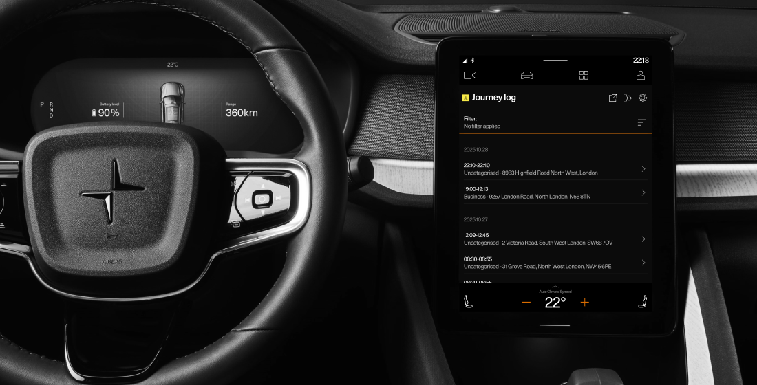
Journey log
Journey log
is an in-car app for Polestar 2, 3, 4 and 5 that records and visualises the user's trip history including, key points, and trip statistics such as distance, date, time, and energy consumption. The app operates in zero-speed mode, it’s only accessible when the car is stationary. This ensures driver safety, while shaping a unique user flow focused on pre- and post-trip interactions rather than use during driving.
Problem
✱ Scrolling made it difficult to view information. Users couldn't see the Add Note feature.
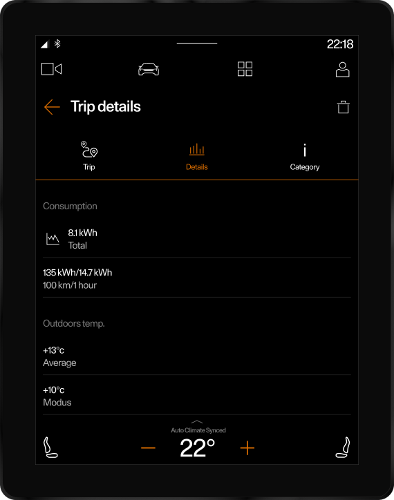
✱ The layout on the Trip Details page for the Model 3 was poorly structured, the icons were too small and not easily accessible, which made navigation difficult.
✱ Trip Note lacked a unified design and appeared differently on each model, which disrupted consistency.
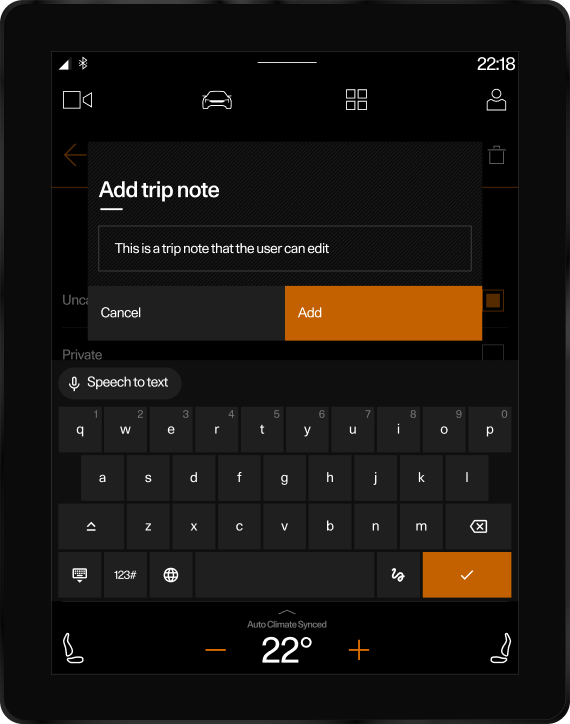
✱ The notes input field was limited to one line, making it impossible for users to see or review their full text.
Goal
To create a clear, consistent, and accessible Trip Details experience across all Polestar models, improving discoverability, readability, and usability while keeping driver safety a priority.
Research
Collected user feedback from platforms, forums, and the Customer Service team. Created a persona and conducted interviews to identify pain points and key insights. Conducted an audit of the current app to evaluate usability, performance, and user experience issues. This data formed the basis for designing an improved design.
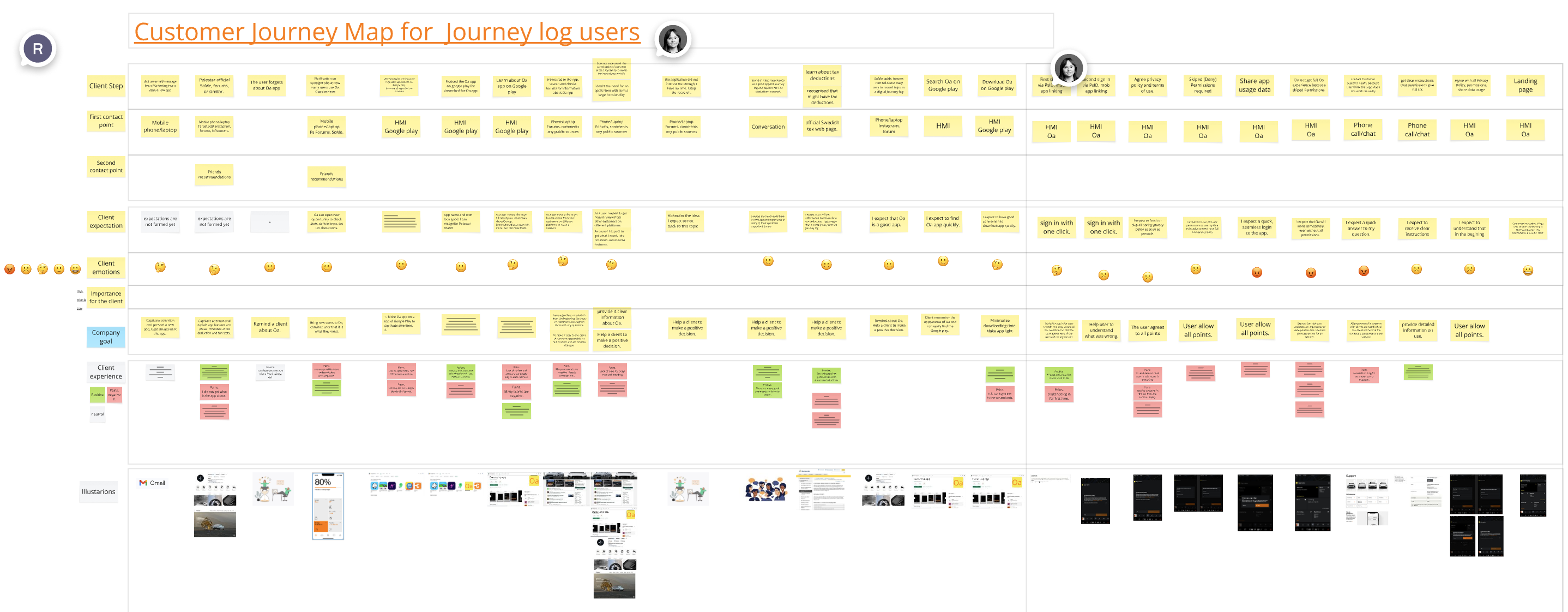
The map highlights every step of his experience, from planning a route at home to post-trip reflection, showing pain points, emotions, and opportunities for improvement.Because the app is not available while driving, the experience focuses heavily on pre- and post-trip interactions, where usability and consistency become critical.This helped identify key areas for design improvements: clearer trip details layout, unified Trip Notes, enhanced map functionality, and a more seamless, data-focused experience across all models.
Process
Customer Journey Map
Before the redesign
Trip details page
✱ The Trip Details page was overly long, requiring unnecessary scrolling. Users often complained they couldn’t add notes. In reality, the Add Note function existed, but was hidden below the fold and easily overlooked.
✱ The note input appeared as a small one-line popup. When users entered text, the field didn’t expand — making it impossible to review or edit the full note, which led to frustration and limited usability.
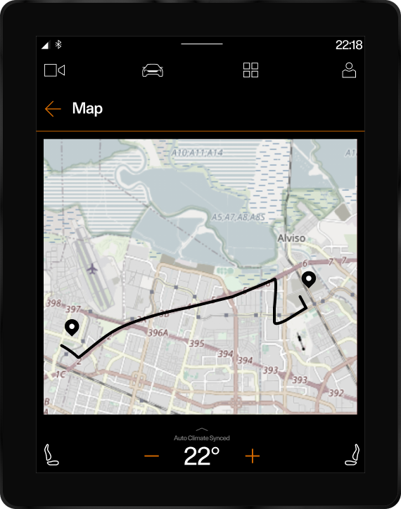
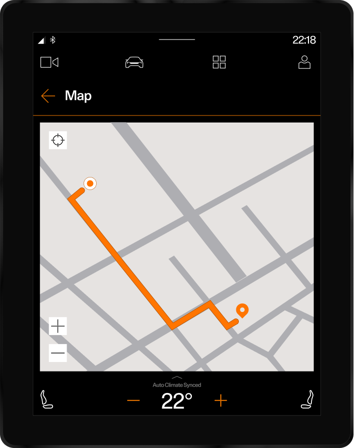
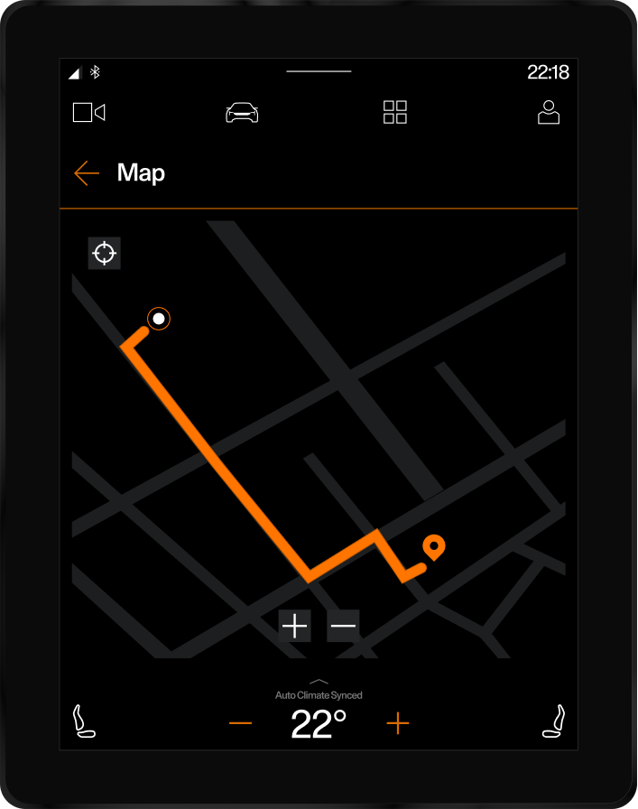
✱ The map visuals were inconsistent with the design system. Route colours didn’t match the brand palette, and the start and end points used identical icons, making trips unclear. Overall, the map lacked visual hierarchy and alignment with Polestar’s design standards.
Redesign
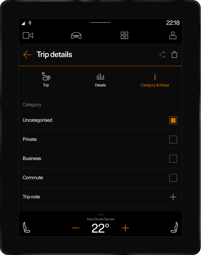
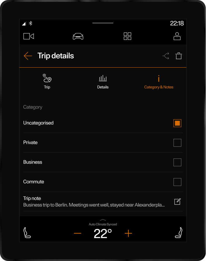
Trip details page
✱ The note input was transformed from a single-line popup into an expanded, persistent text field.
✱ Users can now review and edit their notes in full, improving clarity and usability.
✱ This update enhances the writing experience and creates a more natural flow for documenting trips after each drive.
Map
✱ The map was redesigned to align with the Polestar design system.
✱ Updated route colors and clear start/end point icons improve readability and visual hierarchy.
✱ New zoom and center controls were added for easier navigation, creating a more intuitive and refined user experience.
Design
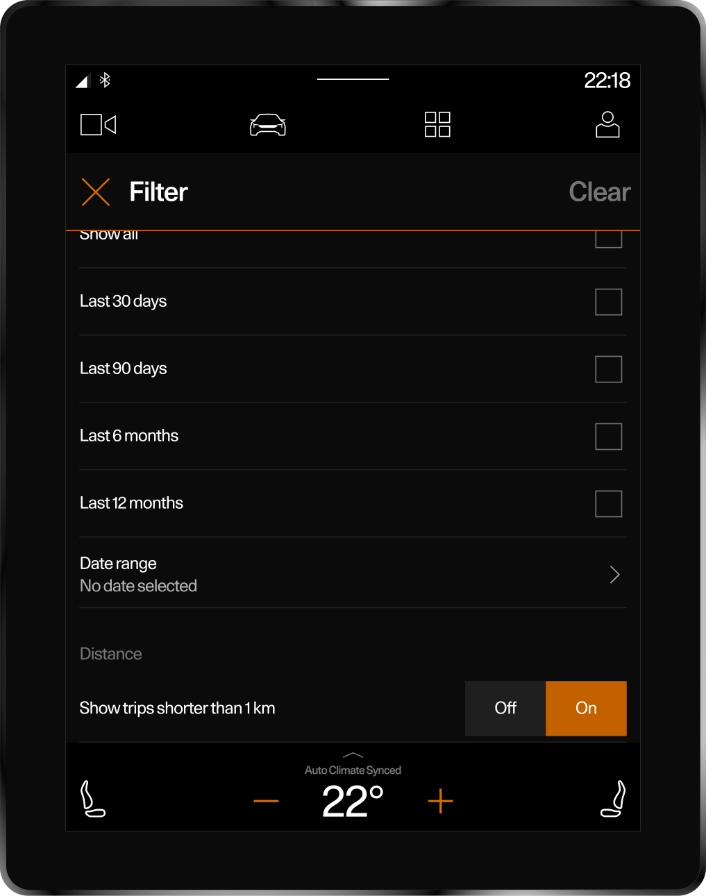
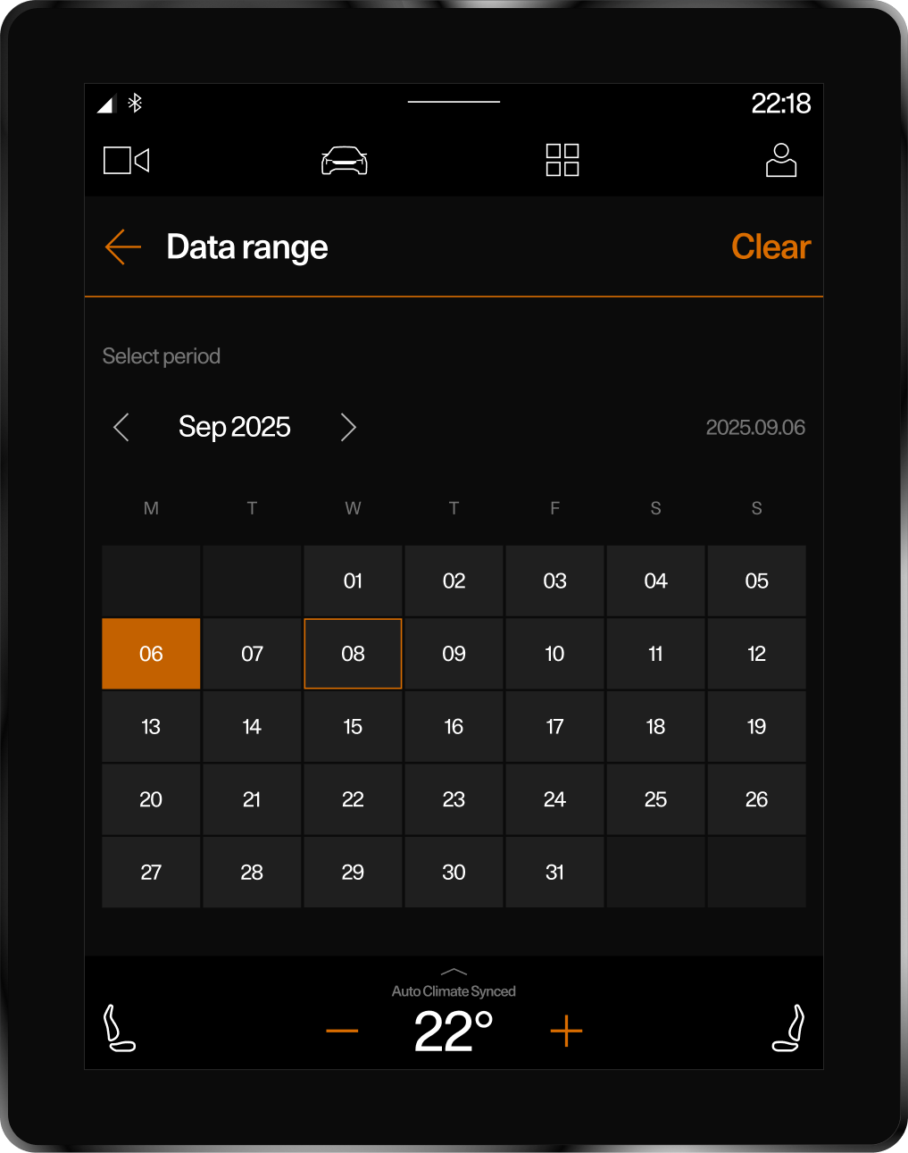
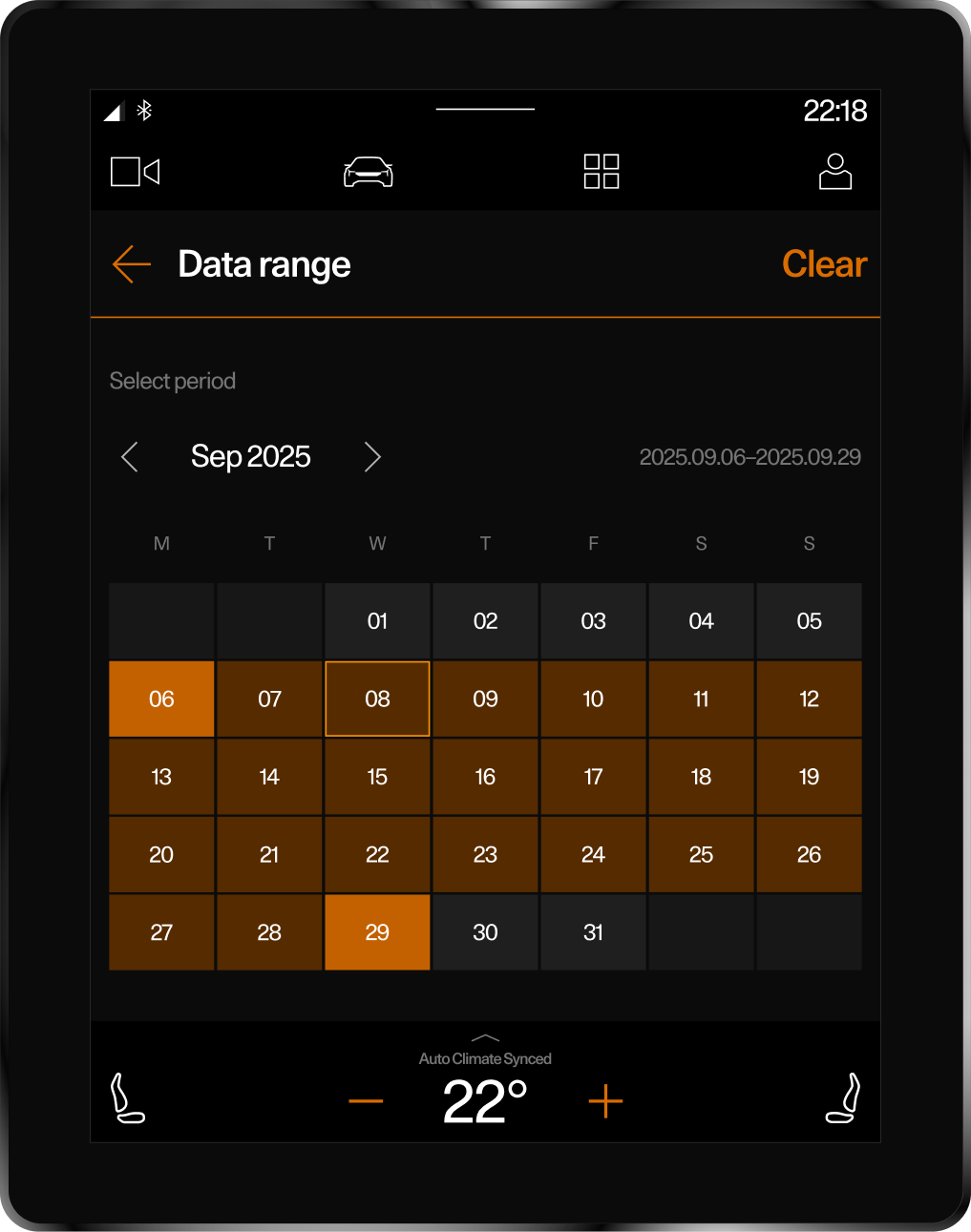
Date picker
A new date picker was introduced to simplify trip filtering and navigation. Users can now quickly switch between past trips without excessive scrolling, improving efficiency and control.
Reflection
Team
Outcomes
This project was developed in collaboration with a product manager, developer, QA engineer, copywriter.I was responsible for UX research, wireframing, UI design, and creating interactive prototypes.
Designing for an in-car, zero-speed environment required rethinking simplicity, visibility, and focus.The updated Journey Log brought clarity and consistency to key interactions — turning small interface changes into meaningful improvements in user experience.
✱ User Satisfaction +30% improvement in average score on Google Play. Since the redesign release, user ratings have shown a consistent upward trend.
✱ Clear input field and visible layout made Trip Notes 60% easy to find and use.
✱ Fewer steps and no scrolling allowed users to complete key actions faster.