Plant Pal
Mob app
Plant Pal
is your trusted companion for plant care. It provides all the information you need about different types of plants so you can grow them healthy and beautiful.

Problem
Many people love plants, but they don't always know how to care for them properly. This can lead to plants becoming sick or even dying.
Goal
Development of a plant care assistant app with a convenient knowledge base search, plant identification by photo, and virtual garden planting. Set up notifications for upcoming plant care.
Research
Conducted comprehensive research to inform the Plant Pal app design. This included competitor analysis of existing plant care apps, creating user personas, and interviewing both beginner and experienced plant owners. Early-stage wireframes were tested with users to validate flows and interactions. Mapped customer journeys, defined Jobs To Be Done (JTBD), and incorporated insights to ensure an intuitive, engaging, and effective plant care experience
Young people living in cities:
People with limited space for growing plants and using pots and containers may be looking for specialized tips and information to decorate their apartment.
Beginner plant growers:
People who are just starting to garden and want to learn more about how to care for plants. They do not have a clear understanding of which plants are suitable for them and how to care for them.
Experienced plant growers:
These users are passionate plant enthusiasts who enjoy exploring and experimenting with different plant species. They dedicate significant time and effort to caring for their plants, seek communities to connect with fellow plant lovers, and constantly seek to expand their knowledge of plants.
Process
Audience
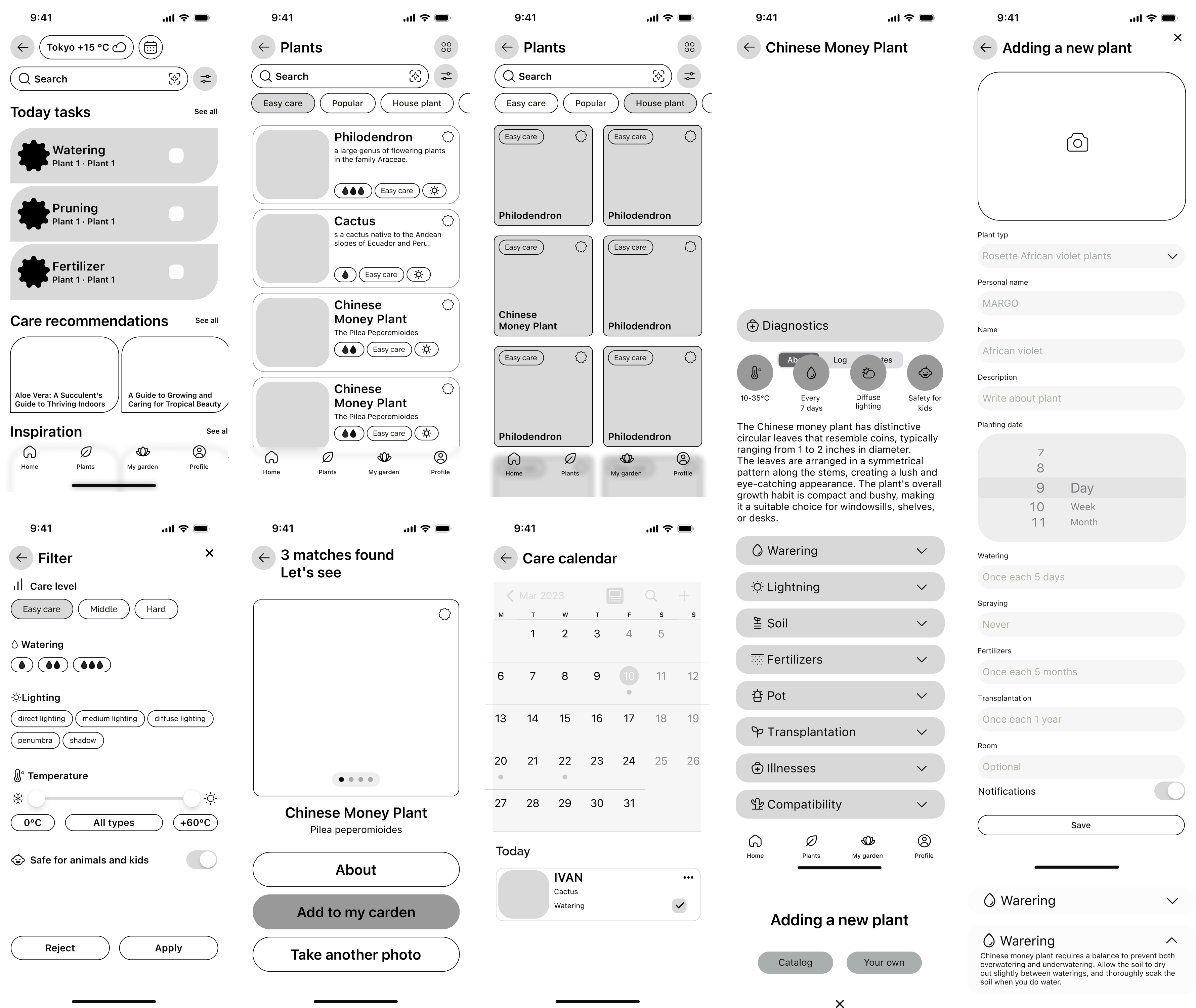
Wireframes
Created mid-fidelity wireframes to visualize the app’s core flows, including plant tracking, care reminders, and plant identification. Early wireframes were tested with users to identify friction points and refine navigation, ensuring a smooth and intuitive experience before moving to high-fidelity design.”

UI kit
Based on iOS design system
UI kit is based on iOS design system principles, ensuring consistency, accessibility, and scalability across the app. Included standardized components such as buttons, input fields, cards, typography, colors, and icons, enabling a cohesive visual language and smooth handoff to developers.

Design
Brand
✱ The color palette is warm to create a cozy atmosphere. Green shades predominate. Analogous green, traditional green, and light green are matched with the primary green. Purple, which complements green, is matched with green. The colors were selected using the Material Design guidelines.
✱ Gradients in the background and transparent design elements, such as the tab bar, buttons, and other elements, create a sense of greenhouses and windowsills where house plants are usually grown.
✱ Rounded, smooth lines predominate in the design of elements, which repeat the natural lines of plants and flowers.
✱ The INTER font family was deliberately chosen to simplify the perception of text. The text is sans-serif and free of decorative elements. Large texts written in INTER are easy to read and understand on the go.


Home Page
✱ Today's tasks greet the user on the main app page, helping them stay focused. They can learn more about the tasks on a separate page or in the calendar.
✱ Rounded, smooth lines predominate in the design of elements, which repeat the natural lines of plants and flowers.
✱ Quick access to the calendar gives users the freedom to plan ahead. The calendar displays tasks for today as plant cards, and users can also view tasks for other days, edit and add tasks as needed.
✱ A selection of articles will help users find inspiration, learn about the problems that plant growers face, and get the right recommendations about plants.


Search by photo
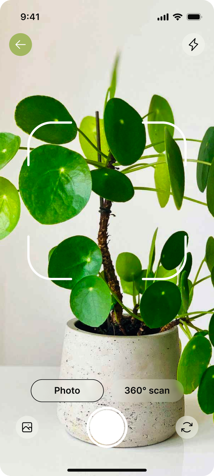
✱ Plant identification using a camera and photo allows users to easily identify a plant without a name, description, or specialized botanical knowledge.
✱ The user can add a plant card to favorites to study the card later.
✱ The user can add a plant card to favorites to study the card later.


Catalog
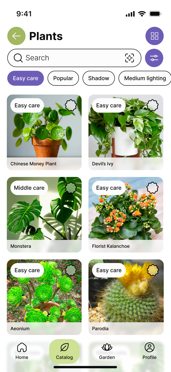
✱ Plant search by catalog is divided into sorting by classical botanical categories, there are filters by main parameters. There is also a classic search by name or keyword.
✱ The search results are displayed in either a list or a card format. Users can easily switch between the two display modes.
✱ The search results are displayed in either a list or a card format. Users can easily switch between the two display modes.


Garden
✱ The user can add plants to their virtual garden from the catalog or create their own plant card.
✱ In users virtual garden, the user can sort plants by rooms or any other convenient categories.
✱ In users virtual garden, the user can sort plants by rooms or any other convenient categories.


Plant card
✱ The plant card has a care journal where you can assign, edit, and plan plant care.
✱ There are also quick notes about the plant. The user can observe the growth of the plant, keep a photo report, keep records of diseases, and add other free notes.
✱ The plant card contains a detailed description, and the key care parameters are displayed in icons for quick reading. If necessary, you can diagnose the disease by photo. The photo can be replaced with your own if necessary.
.png)
.png)
.png)
Reflection
Team
Results
This was a solo project. I handled the full design process, including UX research, wireframing, high-fidelity design, prototyping, and UI kit creation.
Designing Plant Pal taught me the importance of balancing simplicity and functionality for users with varying levels of experience. Early user testing and iterative wireframing helped refine flows and interactions, showing how small design decisions can significantly improve clarity, usability, and overall user satisfaction.
✱ Gained a deeper understanding of user needs for plant care apps, especially for beginners versus experienced users.
✱ Learned how iterative testing of wireframes improves clarity, navigation, and task flow.
✱ Discovered that consistent visual language and micro-interactions greatly enhance engagement and perceived usability.
✱ Learned how iterative testing of wireframes improves clarity, navigation, and task flow.
✱ Discovered that consistent visual language and micro-interactions greatly enhance engagement and perceived usability.