Polestar
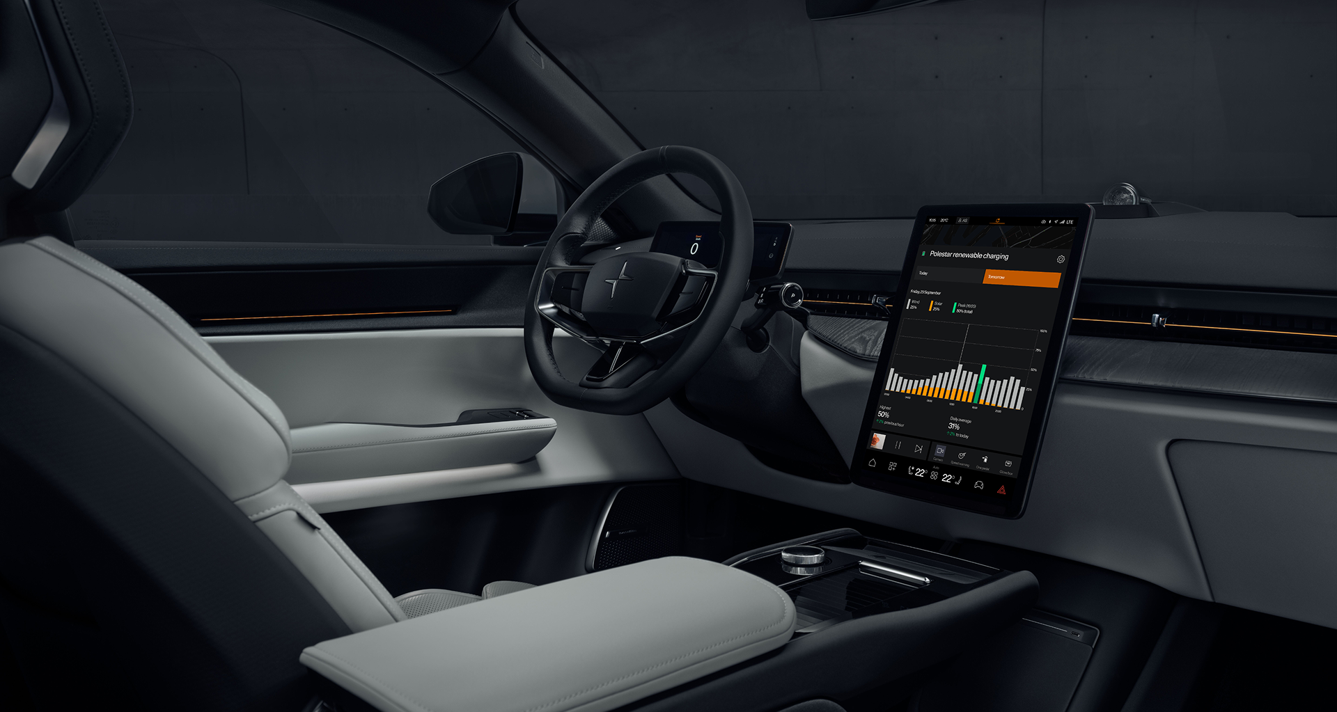
Renewable charging app
Renewable charging app
Changer for Sustainability in the Netherlands.
Polestar is revolutionizing the way we charge electric vehicles (EVs) with a new renewable charging app aimed at Dutch drivers. The app offers real-time data about the country’s energy mix, showing exactly when and where renewable energy is available for EV charging. This data empowers drivers to make informed decisions that directly contribute to reducing their environmental impact.
Problem
While more and more drivers were embracing electric vehicles, they were still unaware of how to power their cars using green energy. The knowledge gap surrounding the energy mix—how much of the grid is powered by renewable vs. non-renewable sources—left many drivers in the dark about how they could make a significant environmental impact through simple, everyday choices.
Goal
Make it easy for users to choose when and where to charge their vehicles using clean energy.
Research
I conducted a secondary research based on existing data, studies and reports to inform UX decisions without directly interacting with users. Key insights included:
✱ Many drivers were unaware of when and where renewable energy was most available.
✱ Charging behaviour was driven by habit rather than sustainability awareness.
✱ Users wanted simple, quick access to relevant charging data.
✱ Behavioural science research identified strategies to nudge users toward green charging, highlighting the impact of timely information and clear visuals.
Polestar drivers in the Netherlands are on a mission for a greener future. They embrace innovation, choosing electric not just for performance but for sustainability. Yet, finding and using truly renewable energy for charging remains a challenge. Between busy schedules and complex energy options, they need a smart, seamless way to power their journey—one that aligns with their values and makes sustainable driving effortless.
Process
Target Audience
Before the redesign
Audit of current version
After auditing the current app, I gathered insights and made the following improvements:
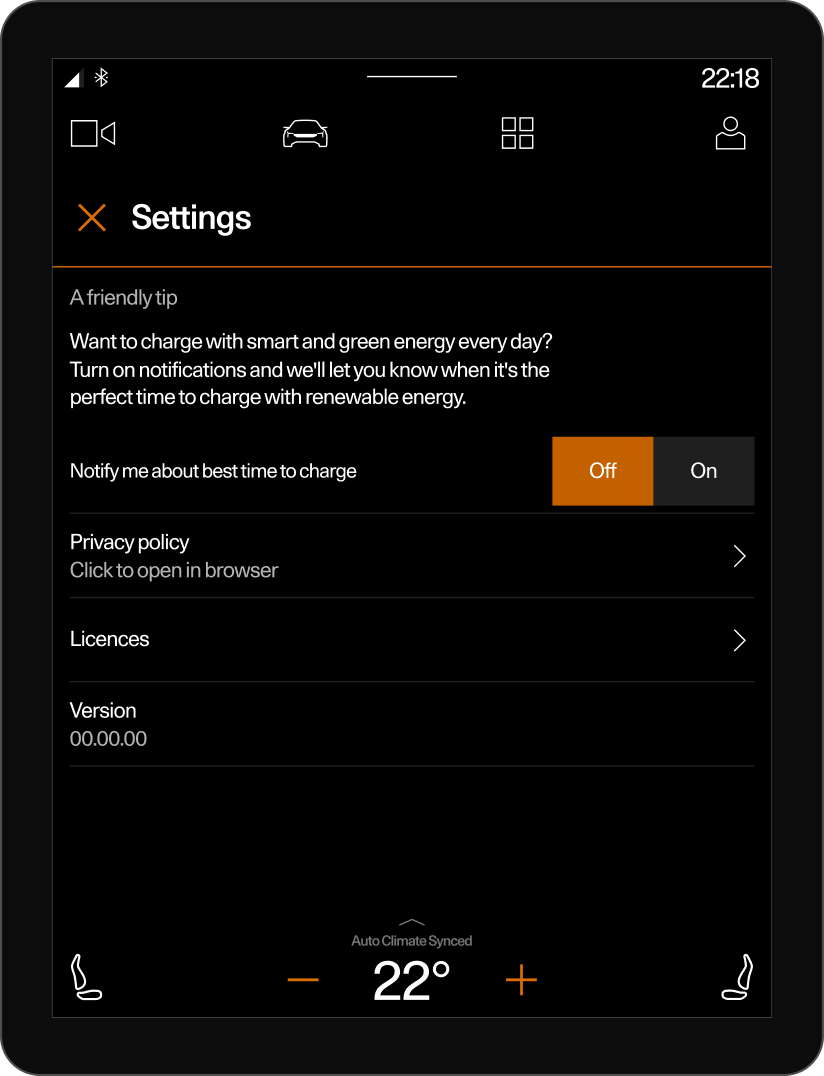
✱ Fixed an error in screen size.Improved the label for the peak by making it solid.
✱ Removed the current time display from the app since it is already shown in the main header (what is this called?) and on the graph.
✱ Refined the logic for peak hours: using 12:00 for a specific hour and 12:00–14:00 for a time range (multiple consecutive hours).
Design
Process
As we embarked on the design journey, our challenge wasn’t just about creating a visually stunning app—it was about creating a tool that could drive behavior change. This wasn’t about a fancy interface or complex features; it was about simplicity and clarity. I had to ensure that the app was intuitive enough for anyone to use, no matter their level of tech-savviness.
Polestar 2
The design features for Polistar 2 are defined by the CDS’s relatively small size of 1024x1365. Considering Google Automotive and Polistar brand guidelines, elements must follow a specific order and size. Designing for the second model is considered quite challenging.
Polestar 3
The third model has its own design system, slightly different from the second model. The colors are brighter, the design components have a more futuristic look, and the typography is more refined. The screen orientation is vertical, with a size of 1280x2048.
Polestar 4
The fourth model features a horizontal screen with a resolution of 2192×1370. Its design system is similar to the third model but has unique characteristics—for example, the tab bar is positioned on the left instead of in the header. Additionally, accent colors are more vibrant, and spacing follows a 32px grid.

Reflection
Team
Outcomes
This project was developed in collaboration with a product manager, developer, QA engineer, copywriter. I was responsible for UX research, wireframing, UI design, and creating interactive prototypes.
To ensure the app was user-friendly and impactful, we conducted multiple rounds of testing for each car model. Feedback loops with Polestar drivers helped refine:
✱ Data readability: Adjusting chart layouts for quicker comprehension.
✱ Notification design: Making green energy reminders non-intrusive yet effective.
✱ Personalization options: Allowing users to tailor insights to their preferences.Through iterative testing, we fine-tuned every element to ensure the app not only looked great but also made sustainable charging a natural, effortless choice.
This wasn’t just an app—it was a tool for change. By prioritizing user experience, behavior-driven design, and impactful visuals, we created a platform that empowers Polestar drivers to make conscious, sustainable decisions effortlessly.And with every charge powered by renewable energy, we’re shaping the future of green mobility—one smart decision at a time.
.png)
%20copy.png)